Hey everyone...sorry I have been a bit of a slacker blogger this week! We've been off our normal schedule this week! More on that later...
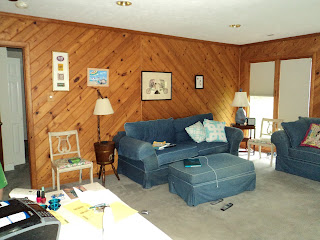
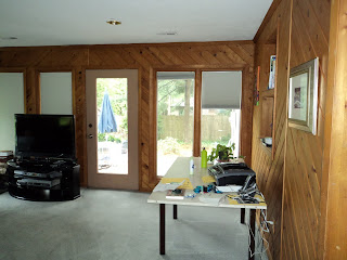
I have a fun project for everyone to take part in though! I was so excited when my friend Emily, who I used to teach with, emailed me and said she wanted to do a little thrifty decorating to her family room. I thought it would be fun if you guys looked at her current room then commented on some easy and inexpensive ways to fix it up!
I already have some ideas but want to hear what you guys think! Here are her current digs:
Oh, and you'll notice my children in one of these pics. They were supposed to be my "helpers" but they turned into animals who mistook Emily's house for a playground. UGH...one of those moments I really wish I had one of those weird kiddie backpacks with the leash attached! Would have really come in handy!
So what do you guys think she should do? We would love it if you left a comment with a helpful suggestion! I'll do a post next week to sum up all your suggestions and add mine too!
Wednesday, May 4, 2011
Subscribe to:
Post Comments (Atom)


question: does she love the wood? if so, i think it's fab & would keep it.. focusing on rest of the space. works because of the type of paneling it is, and the fact there's tons of natural light.
ReplyDeletei would ditch the mini blinds for roman shades, or updated blinds w/ light control built in, in shade of gray to coordinate with the carpet. [the light control from the blinds most helpful while watching the tv, in such a bright space] but the thing that glares out for me, the furniture placement. i call it, furniture fear.. all of the furniture is scared against the wall. ;) i would orient the sofa to face the bank of windows, as it's the obvious focal point in the room. but would also include the corner stove, so conversation area is instantly made as well. this would free up the old sofa wall for the tv.. and not have to have it in front of windows. if your friend loves the furniture, might just suggest some white slipcovers to lighten them up and give her a neutral canvas.. then she would be free to add color & pattern in the pillows & accessories.
look forward to seeing what you suggest.. and how it all comes out. have fun! :)
first things.... PAINT THOSE WALLS WHITE!!! what direction does she want to go? it's pretty much a blank slate. she could keep the sofas, and use your blog design as inspiration colors. :)
ReplyDeleteI agree with painting the walls white. Love the fireplace, maybe new covers for the sofa or replace it if thats in the budget. A lovely mid century one would look fab I think.
ReplyDeleteThis room has loads of potential! For starters I agree with painting the walls and trim white.
ReplyDeleteIt looks like she has some good furniture to work with. I would slip cover the sofas and ottoman with a light neutral color - white or light grey etc. and dress the sofas up with pillows. I would mix and match fabrics in order to take advantage of fabric store remnants. I am picturing 60's era bright colors - yellow, navy, red, orange - and bold patterns. This pallet is inspired by the very mod fireplace.
I would paint the two chairs a bright color (any mentioned above)and recover the seats to coordinate with the pillows. I'd also pull the furniture into the room and off the walls. The rooms appears to have some great wall space that would be perfect for a floor to ceiling gallery wall. This would bring more color into the room and soften the paneling.
I can't wait to see what you do with this room!
I totally agree, paint those walls!! A fun, new painted piece for the tv stand. I also like the idea of a gallery wall. She could keep those sofas. Add some drama to the windows with curtains. Should be fun. Keep us posted!
ReplyDeleteAmy ~mysunshineshere
I vote paint the walls. The wood closes the room in a lot. Also, if it were me, I would recover the sofas. Stay with a neutral, have a seamstress make a custom removable slip cover so it can be popped in the wash if needed. The couches look comfy and have a good shape though. Curtains! In a bold print, but not too colorful, something geometric? It is a lovely space, I can't wait to see what y'all do with it!!
ReplyDeleteoh! So much potential, but painting the wood paneling would be priority #1. Some colorful window treatments would be nice and maybe some task lighting. I would also split the room (since it's so large) and add some workspace/place-space to the other side of the room, giving the room a more multi-functional feel! :) Can't wait to see what you do!
ReplyDelete-Ashley
www.DesignBuildLove.co
Ditto on painting the walls! We did this on our third floor and it made the world of difference. Love the idea of adding some mid century modern pieces to the room (thrifty finds by Erin, of course). If the walls are light, I think bamboo roman shades would look amazing on those windows.
ReplyDeleteDefinitely paint the walls!!! That was my first instinct. Second was a gallery wall behind the sofa with thrifted items. Maybe replace the sofa??? Find a great thrifted pair of chairs paint them the same color/have them upholstered in the same fabric. Use that fabric for cushions on the couch. Replace the side tables and get a thrifted pair of matching lamps. NEW TV CONSOLE!! Ok...those are my thoughts for now...lots of potential! Can't wait to see what you have come up with!
ReplyDeleteThe wall panelling could work if the furniture was updated with more of a streamlined modern minimal (swedish?) style. Most likely, though, I bet the cheaper way to go might be thrift some great pieces (desk, ottoman etc) and do it up with paint... paint the panelling, paint the furniture, breezy cottage style. Good luck!
ReplyDeleteShoot. Right after I hit enter I remembered Sarah Richardson's cottage... with all the wood panelling.
ReplyDeletehttp://www.hgtv.ca/sarahscottage/episodes.aspx?sectionid=300&categoryid=5139012412070827990&postid=67412
You have to check it out!
Definitely white walls or some other light color. It looks like she has a beachy vibe going on with her couch, the picture, and the white chair. I think a nice cottage feel would work well. What a fun project!
ReplyDelete